
An ad performance report pulls impressions, clicks, conversions, and spend from every platform you run ads on into one view, so you can spot what’s working and cut what isn’t. Done right, it turns scattered platform dashboards into a decision engine: faster budget calls, clearer ROI conversations, and fewer surprises at month end. The mechanics involve a handful of core KPIs, an API or connector to pull the data, and a repeatable format, often stitched together through a market intelligence tool like Prowl.
TL;DR:
- Most effective ad reports focus on primary KPIs such as impressions, clicks, conversions, and ROAS, tailored to the campaign’s specific goal.
- Automating data collection via a single, normalized connector reduces maintenance time, ensures consistent attribution, and speeds up report generation across platforms.
- Segment performance by device, placement, and attribution window to uncover actionable insights and avoid misleading averages that hide key issues.
- Matching report cadence to the audience’s decision-making cycle prevents data overload and increases report relevance and readability.
- Revisit benchmarks regularly and base targets on your own account’s historical data, adjusting strategies based on impact, confidence, and effort to optimize results.
Table of Contents
- What Is Ad Performance Reporting and Who Needs It?
- Which KPIs Actually Belong in an Ad Performance Report?
- How Do You Collect and Automate Ad Performance Data?
- What Report Format and Cadence Should You Use?
- How Do You Turn Report Data Into Actual Optimizations?
- When Should You Use a Consolidated Intelligence Connector?
- How Should You Handle Segmentation and Attribution?
- What Goes Wrong Most Often in Ad Performance Reporting?
- How Do You Make Ad Performance Reports Easier to Read?
- Which Tools Handle Ad Performance Reporting Well?
- How Do You Set Realistic Ad Performance Targets?
- Checklist for Reports That Actually Drive Decisions
- Automate Ad Performance Reporting With Prowl
- Sources
- FAQ
What Is Ad Performance Reporting and Who Needs It?
Ad performance reporting is the practice of collecting, structuring, and presenting data on how your ad campaigns are performing against defined goals. It’s built for media buyers who need daily pacing checks, marketing managers who report to leadership monthly, and agency leads who have to prove value to clients every week.
The same report format rarely serves every audience. A media buyer wants granular, near real time numbers. An executive wants three trend lines and a dollar figure. Because of that, most teams end up producing multiple versions from one dataset:
- Daily ops monitoring: quick dashboards flagging budget pacing and spend anomalies
- Weekly optimization reviews: segmented performance breakdowns tied to specific tests
- Monthly executive summaries: ROI trends, spend justification, and forward budget asks
Deliverable format follows the audience. Internal teams often work straight out of live dashboards. Clients and executives tend to get PDFs or slide decks. Analysts frequently prefer raw spreadsheets they can pivot themselves.
Which KPIs Actually Belong in an Ad Performance Report?
Not every metric deserves a row in your report. The primary metrics worth anchoring around are impressions, clicks, click-through rate (CTR), cost per click (CPC), conversions, cost per acquisition (CPA), and return on ad spend (ROAS) or return on investment (ROI). These are the numbers that map directly to spend decisions, and they’re the backbone of most advertising metrics frameworks, which center on impressions, CTR, CPC, conversion rate, and ROI as the metrics that demonstrate campaign effectiveness to stakeholders.
Statistic Callout: Ad performance reports built around impressions, CTR, CPC, conversion rate, and ROI give stakeholders a consolidated view for tracking and optimizing campaigns, according to Mailchimp’s advertising metrics guide. That combination is what turns raw spend data into something a finance team can actually act on.
Below the primary layer sit supporting metrics that explain why the top-line numbers moved:
- Impression share: shows whether you’re losing volume to budget caps or competition
- Frequency: flags creative fatigue before CTR collapses
- View-through conversions: catches credit that click-only tracking misses
- Ad strength or relevance scores: early warning for creative or landing page mismatch
Match your metric set to the campaign objective. An awareness campaign lives or dies on impressions, reach, and frequency. A lead-gen campaign cares about CPA and lead quality. An ecommerce campaign should be built entirely around ROAS, since a “cheap” click that never converts is worse than an expensive one that does.
How Do You Collect and Automate Ad Performance Data?
Most reporting failures start here, not in the analysis. You’re usually pulling from three source types: platform APIs (Google Ads, Meta, Microsoft Advertising), analytics platforms (GA4, Adobe), and CRM systems for revenue attribution. Each has trade-offs. Platform APIs give the freshest numbers but require maintenance every time a platform changes its schema. Analytics platforms give you cross-channel context but often lag by a day or two. CRM data gives you real revenue, but it’s usually the slowest to sync.
Before any numbers hit a dashboard, normalize four things:
- Time zone: align every platform to one reporting time zone, or your daily numbers won’t match
- Currency: standardize to one currency if you run cross-market campaigns
- Attribution window: pick one window (7-day click, 30-day click, whatever fits your sales cycle) and apply it everywhere
- Naming conventions: enforce consistent campaign and ad-set naming so segmentation actually works later
For automation, you’ve got three practical routes. Native connectors inside platforms like HubSpot’s custom report builder sync ad accounts and derived metrics automatically. ETL pipelines give you more control but need engineering time. Scheduled scripts are the scrappy middle ground: Google Ads scripts can generate a weekly spreadsheet from a template and populate it automatically, which is a pattern a lot of in-house teams lean on before they invest in heavier tooling. Reporting APIs like Microsoft’s AdPerformanceReportRequest let you specify aggregation, columns, filters, and time range directly, which matters once you need custom cuts a dashboard doesn’t offer.
Pro Tip: Write your normalization rules down in the report itself, not just in a shared doc someone will forget to check. A footnote that says “all figures in EST, 7-day click attribution” saves you from a painful reconciliation argument three months later.
What Report Format and Cadence Should You Use?
The mismatch between report cadence and audience need is one of the most common reasons reports go unread. Send an executive a daily spend dashboard and they’ll ignore it. Send a media buyer a monthly summary and they’ll miss the budget pacing issue that needed fixing on Tuesday.
A workable structure looks like this:
- Daily dashboard: spend pacing, budget alerts, CTR and CPC anomalies, delivered live or via a lightweight email digest
- Weekly optimization report: segmented performance by campaign, audience, or placement, plus what tests ran and what’s recommended next
- Monthly executive summary: trend lines, ROI or ROAS by channel, and any budget reallocation requests, usually delivered as a PDF or slide deck
A simple template checklist keeps this consistent: date range and attribution window at the top, core KPIs in the middle, a callout box for anomalies or wins, and a one-line “what changes next” recommendation at the bottom. Every cadence gets that same skeleton, just with different depth.
How Do You Turn Report Data Into Actual Optimizations?
A report that just sits there restating numbers isn’t reporting, it’s archiving. The value comes from a repeatable triage process that separates noise from real signal.
- Triage for cost versus conversion rate mismatches first. If cost per click rose but conversion rate held steady, that’s a bidding or competition problem. If conversion rate dropped while cost held flat, that’s a landing page or offer problem.
- Check attribution and segmentation before you touch a bid. A drop in reported conversions is sometimes just a broken pixel or a shifted attribution window, not an actual performance issue.
- Prioritize fixes using impact, confidence, and effort. A test with high potential impact, high confidence, and low effort (like pausing an underperforming ad) beats a high-impact, low-confidence, high-effort rebuild every time.
- Run the test and validate before scaling. Compare results on the same attribution window you used to spot the problem, and use a short A/B test or a holdout group where you can, since informal before-and-after comparisons are easy to fool yourself with.
Google’s own guidance backs this same loop: consistent conversion tracking, ROI measurement, and search terms analysis drive continuous optimization, especially when Ads data gets paired with Analytics for the fuller picture.
Pro Tip: Before you touch a single bid, ask whether the metric that moved is a leading indicator or a lagging one. CTR moves fast and is easy to overreact to. ROAS moves slow and tells you the truth. Weight your reaction accordingly.
When Should You Use a Consolidated Intelligence Connector?
Once you’re pulling data from four or five platforms, maintaining separate connectors for each one starts eating more time than the analysis itself. A consolidated connector approach flips the order of operations: connect accounts once, select the KPIs you care about, let the system normalize time zones and attribution windows, then generate dashboards, PDFs, or slide decks directly from that normalized dataset.
That’s the workflow this approach is built around. Instead of maintaining separate API integrations for every ad platform, Prowl connects through a single market intelligence layer that any AI agent or workflow can call. Practical benefits worth naming:
- One connector to maintain instead of five separate platform integrations
- Faster report turnaround since normalization happens automatically instead of manually
- Consistent attribution logic applied across every channel in the same report
Teams already stretched thin on engineering time tend to feel this benefit first, since automated connectors cut down the number of scheduled jobs that quietly fail overnight.
How Should You Handle Segmentation and Attribution?
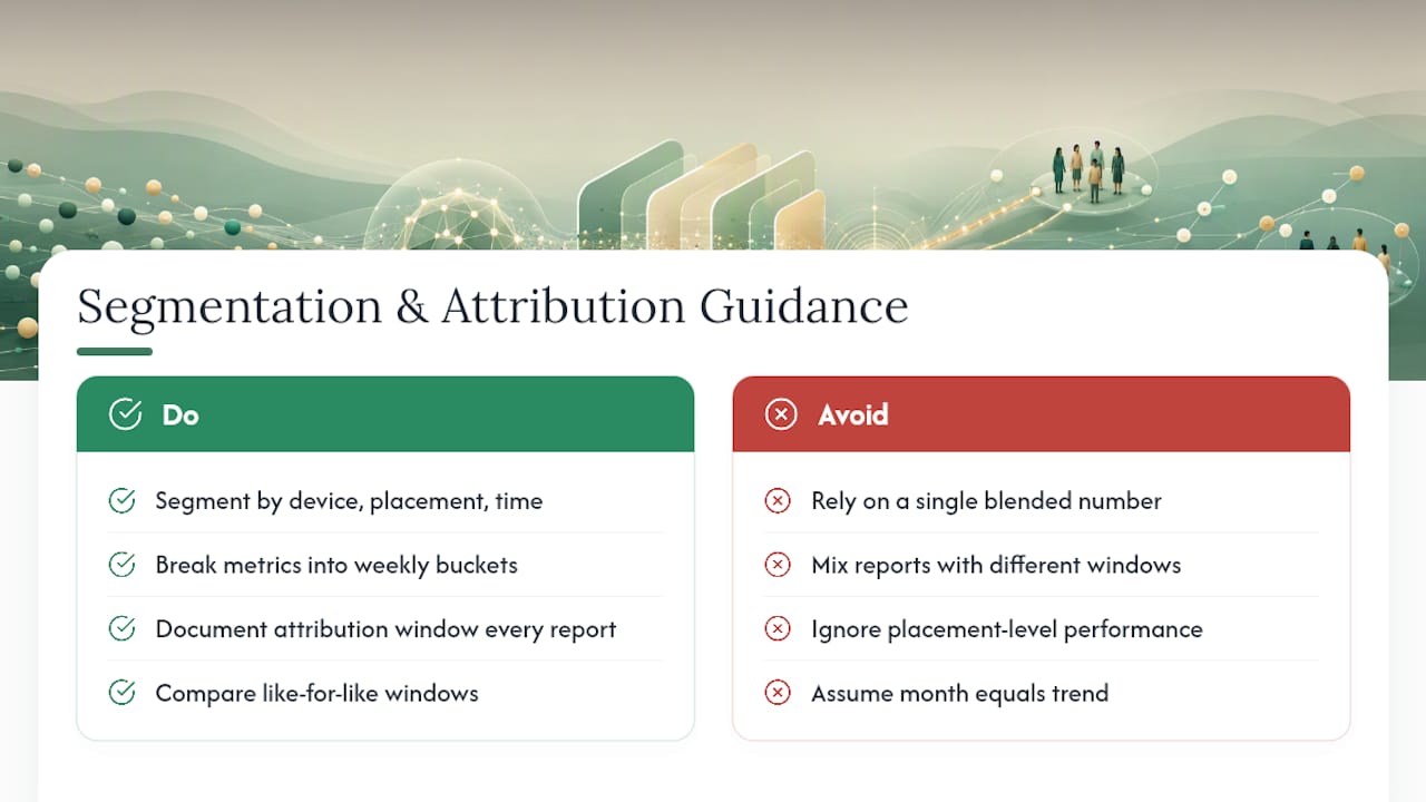
A single blended number almost always hides the real story. Segmenting by device, placement, and time window is what turns “conversions dropped 8%” into “conversions dropped 8% on mobile placements between 6 PM and 9 PM,” which is an actual, fixable insight.
Time windows matter more than most reports admit. A campaign that looks flat over 30 days might be masking a strong first two weeks followed by a fatigue-driven decline in weeks three and four. Break performance into weekly buckets inside the same report period before drawing conclusions from the monthly total.
Device segmentation catches problems blended numbers hide. Mobile and desktop users often convert at meaningfully different rates depending on your landing page’s mobile experience, and a campaign that looks mediocre overall might be excellent on desktop and dragging on mobile.
Placement segmentation matters just as much, particularly on platforms that auto-place ads across a network of properties. A campaign running well on search placements can look worse in a blended report if it’s also running on lower-intent display placements pulling the average down.
Attribution window choice changes your numbers more than almost any other setting. A 7-day click window will always show fewer conversions than a 30-day window for the same campaign, which means comparing two reports built on different windows is comparing two different metrics wearing the same label. Apple’s ad reporting guidance treats attribution window definition as a foundational setup step precisely because normalization failures here are the most common cause of misleading cross-channel comparisons. Document your window choice in every report, every time, even when it feels repetitive.
What Goes Wrong Most Often in Ad Performance Reporting?
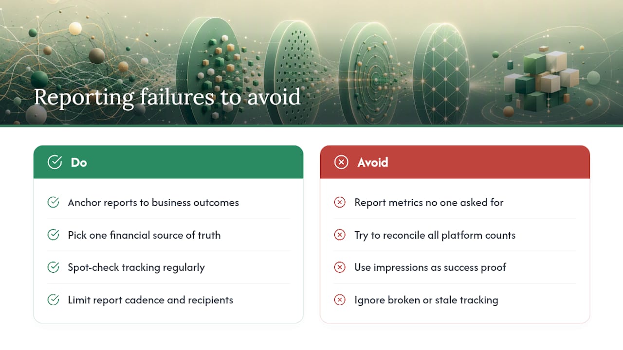
The most common failure isn’t a missing metric. It’s reporting numbers that don’t answer a question anyone actually asked. A report full of impressions and clicks without a conversion or revenue tie-in tells you activity happened, not whether it mattered.
Platform-reported metrics rarely match each other exactly, and that discrepancy trips up a lot of teams the first time they see it. A platform’s own dashboard might count a conversion differently than your analytics tool does, based on different attribution logic or tracking methods. Treat one platform as your source of truth for financial reporting and use the others as directional signals, rather than trying to reconcile every number to match perfectly.
Vanity metrics creep in when a report needs to look good more than it needs to be useful. Impressions and reach are easy to inflate through spend and feel impressive in a slide deck, but they say nothing about whether the campaign made money. Anchor every report around a metric tied to business outcome, even if that means a smaller, less flattering headline number.
Stale or broken tracking is a silent killer. A pixel that stopped firing three weeks ago will make a campaign look like it’s failing when the real problem is a measurement gap, and teams sometimes pause a working campaign because of it. Spot check your tracking setup on a schedule, not just when numbers look wrong.
Cadence mismatch and report fatigue round out the common failure list. Sending too many reports to too many people trains everyone to skim rather than read, which defeats the entire purpose of building the report in the first place.
How Do You Make Ad Performance Reports Easier to Read?
Good data visualization in an ad report isn’t about making it look polished, it’s about making the right number impossible to miss. A dense table of twenty metrics buries the one that actually matters this week.
Lead with the change, not the total. A line chart showing CPA trending up over four weeks tells a story a static number can’t. Pair every chart with a single sentence explaining what changed and why, rather than leaving the reader to infer it themselves.
Color should mean something consistent across every report you send. If red always means “underperforming versus target” and green always means “on or above target,” readers start scanning for color before they even read numbers. Switching that convention between reports forces people to relearn your system every time.
Cut the metrics that don’t drive a decision this cycle. A monthly executive summary doesn’t need hourly impression data, and a daily pacing dashboard doesn’t need a 12-month trend line. Match the detail level to the decision the reader actually has to make.
Storytelling in a report means answering “so what” before the reader has to ask it. A number without context is trivia. The same number paired with a target, a trend direction, and a recommended action is a decision tool. That one-line “here’s what this means and here’s what we’re doing about it” note at the bottom of every section is often the single highest-value line in the whole document.
Which Tools Handle Ad Performance Reporting Well?
Spreadsheets remain the default starting point for a lot of teams, and for good reason: they’re flexible, everyone knows how to use them, and pulling data via Google Ads scripts into a template sheet costs nothing beyond setup time. The tradeoff is that spreadsheets don’t scale gracefully once you’re managing more than two or three ad accounts, and manual refresh cycles introduce the exact staleness problems covered above.
Dedicated reporting platforms solve the scaling problem by syncing ad accounts directly and generating dashboards with less manual upkeep. Some, like HubSpot’s custom report builder, now layer AI-generated summaries on top of synced metrics, which helps non-technical stakeholders parse a dashboard without needing someone to walk them through it.
Native platform reporting, whether inside Google Ads, Meta Ads Manager, or Microsoft Advertising, still matters for granular, platform-specific detail that a consolidated dashboard often smooths over. Developer-facing report documentation, like Uber Ads’ ad performance report specs, shows how detailed metric availability and time-range constraints actually get exposed at the API level, which is worth understanding before you commit to building custom automation on top of any single platform.
The connector layer sits above all of that: rather than picking one platform’s dashboard or building custom API integrations for each network separately, a market intelligence tool can maintain those connections centrally and hand back a normalized report regardless of which platforms fed into it.
How Do You Set Realistic Ad Performance Targets?
Benchmarks are only useful when they’re scoped to your specific industry, platform, and campaign objective, since a “good” CTR in search looks nothing like a “good” CTR in display. Pulling a generic industry average and applying it to your account without adjusting for objective or platform is one of the fastest ways to set a target that either demoralizes your team or hides real underperformance.
Build your first real benchmark from your own account’s trailing 90 days rather than an industry number pulled from a blog post. That gives you a baseline grounded in your actual audience, creative, and offer, which is a fairer comparison than an aggregate figure that includes accounts nothing like yours.
Once you have an internal baseline, layer in a directional target tied to a specific initiative rather than a flat percentage improvement. “Reduce CPA by improving landing page conversion rate” is a target you can actually diagnose failure or success against. “Improve CPA by 15%” with no mechanism attached just becomes a number people either hit or don’t, without anyone learning why.
Revisit targets every quarter at minimum. Platforms change auction dynamics, competitors enter and exit, and a target set six months ago against a different competitive landscape stops being a fair yardstick fairly quickly.
Checklist for Reports That Actually Drive Decisions
Every metric in a report should connect to a decision someone is actually going to make. If a number doesn’t change what happens next, cut it. Avoid vanity metrics that flatter a slide but don’t move budget. Document your attribution window and time zone assumptions every single time, even when it feels repetitive, because that’s exactly the detail that gets forgotten and causes arguments later.
The best reporting habit isn’t a tool or a template. It’s the discipline to ask “what will this number make someone do differently” before it ever makes it into the deck.
— Sergey
Automate Ad Performance Reporting With Prowl
Building and maintaining separate API connections for every ad platform is the part of reporting nobody enjoys, and it’s usually where reporting projects quietly stall. Using a single connector instead of five can link any AI agent or workflow to a large number of marketing intelligence tools through one API, so pulling cross-channel ad performance data, competitor benchmarks, and SEO context into one report doesn’t require standing up separate integrations for each platform.

For reporting specifically, this enables normalized KPIs, dashboards, and export formats like PDF, PPTX, or interactive reports generated from one connected source instead of stitched together by hand. Teams juggling multiple client accounts and analysts who need a fast, defensible view of campaign performance benefit, since this approach is built around exactly that kind of repeated, multi-source reporting need. Browse real reporting and analysis use cases to see how a connector applies to ad performance work specifically, or head to getting started to connect your first ad account and generate a report.
Sources
- Top Advertising Metrics to Track for Better Campaign Performance | Mailchimp
- Explore and visualize insights | Apple Ads reporting
- How to analyze Google Ads successfully | Google Business
- AdPerformanceReportRequest - Microsoft Advertising docs
FAQ
How Do You Measure Ad Performance?
You measure it by tracking core metrics like impressions, CTR, CPC, conversions, and ROAS against a specific campaign objective, then segmenting by device, placement, and time window to find where performance actually shifted.
What Is an Ad Report?
An ad report is a structured document or dashboard that consolidates advertising metrics like spend, clicks, conversions, and ROI so marketers and stakeholders can track campaign performance and make budget decisions.
What Does a Google Ads Performance Report Show?
A Google Ads performance report shows metrics like impressions, clicks, CTR, CPC, conversions, and cost data at the campaign, ad group, or keyword level, and it’s often paired with Analytics data for a fuller conversion picture, per Google’s own guidance.
When Should You Report on Marketing Campaign Performance?
Reporting cadence should match the decision being made: daily for budget pacing and anomaly checks, weekly for optimization and testing decisions, and monthly for executive-level ROI and budget reviews.
Can a Single Tool Handle Multi-Platform Ad Reporting?
Yes. Consolidated connector platforms, including Prowl, can pull data across ad networks and other marketing sources into one normalized report, reducing the need to maintain separate integrations for each platform.