
A product analytics framework is a structured system for choosing, organizing, and interpreting metrics so every number maps to a decision. The one action to take first is building a KPI map: for every metric you track, name the owner, the threshold that triggers a call, and what happens when it’s crossed. The rest of this guide covers the major frameworks, the analyses worth running, and a step-by-step build process you can start this week.
TL;DR:
- Building a KPI map with clear owners, decision thresholds, and a decision-triggering logic is essential to create trust and ensure actionability.
- Selecting the appropriate framework depends on the product stage and question; AARRR for growth, HEART for feature experience, and North Star for organizational alignment.
- Combining multiple analysis types, such as funnel, cohort, segmentation, attribution, and qualitative signals, provides comprehensive insights into product performance.
- Regular review, pruning unused metrics, and assigning explicit ownership prevent data drift and keep the framework trustworthy.
- Automating data collection and reporting, for example through tools like Prowl, accelerates framework implementation and keeps metrics current and reliable.
Table of Contents
- What is a product analytics framework?
- Why product teams need a metrics framework, not just more data
- Should you use AARRR, HEART, or North Star?
- What types of analyses belong in the framework?
- How to build a product analytics framework step by step
- Structuring metric trees, targets, and guardrails
- How do you keep instrumentation trustworthy?
- Turning dashboards into decisions and action
- Common product analytics mistakes to fix now
- Real-world examples of product analytics frameworks in action
- Aligning the framework with business goals and strategy
- Who owns what: stakeholder roles in the framework
- Practitioner notes: quick wins for low-maturity teams
- Build and scale your framework faster with Prowl
- Sources
What is a product analytics framework?
Most product teams don’t lack data. They lack a system for knowing which number matters when someone asks a hard question in a leadership meeting. A product analytics framework is the structured approach to choosing, organizing, and interpreting metrics so they answer specific business questions instead of just filling a dashboard.
The difference between a framework and a dashboard is intent. A dashboard displays numbers. A framework decides in advance which numbers exist, who owns them, and what action follows when they move. That distinction is what lets a VP glance at a report and know whether to intervene, rather than asking three follow-up questions before anyone can act.
You need a formal framework once you notice these signals:
- Different teams report different numbers for the “same” metric (activation, retention, churn) with no shared definition.
- Leadership asks “where does this number come from?” more often than “what should we do about it?”
- New dashboards get built faster than old ones get retired.
- Nobody can say, without checking, who owns a given metric or what threshold would trigger a response.
Why product teams need a metrics framework, not just more data
A framework earns its keep by translating product activity into language a CFO or CEO already trusts: revenue, payback period, retention economics. “Weekly active users grew 12%” is a vanity line item until you connect it to expansion revenue or reduced support cost. A real framework forces that connection at the design stage, not after the fact.
Each metric in the framework should carry decision-trigger logic: if this number crosses this line, this person takes this action. Without that logic, teams drown in dashboards nobody trusts and nobody acts on. ProductPlan’s guidance is blunt about the most common failure mode here: tracking dozens of metrics with no tie to a decision, then wondering why nothing changes when the numbers move.
The framework earns its value in a few concrete ways:
- It cuts the time between “the number moved” and “we know what to do.”
- It gives every metric a named owner instead of leaving it to whoever built the dashboard.
- It reduces the noise that makes leadership stop trusting the data entirely.
Should you use AARRR, HEART, or North Star?
The three frameworks answer different questions, and picking the wrong one for your stage wastes months. Commonly used frameworks include AARRR (Pirate Metrics), HEART, and the North Star Framework, each built for a different job.
AARRR (Acquisition, Activation, Retention, Referral, Revenue) maps the full growth funnel. It’s the right fit for early-stage or growth-focused products where the question is “where in the funnel are we losing people?”
HEART (Happiness, Engagement, Adoption, Retention, Task Success) measures experience quality rather than growth velocity. HEART works best when paired with a goal-signal-metric structure that ties each dimension to a concrete signal before you assign a metric. It’s built for evaluating a specific feature or redesign, not the whole business.
North Star organizes the entire company around one metric that represents durable customer value delivered. It doesn’t replace AARRR or HEART. It sits above them, using their outputs as inputs.
| Framework | Best for | What it answers |
|---|---|---|
| AARRR | Early or growth-stage products | Where in the funnel are we losing users? |
| HEART | Feature-level UX evaluation | Is this experience actually good? |
| North Star | Org-wide alignment | Is the whole company moving toward customer value? |
Most mature product organizations combine them: North Star at the top, AARRR or HEART feeding it from below. Trying to run all three as separate, disconnected systems is usually a sign you haven’t picked a North Star yet.
What types of analyses belong in the framework?
A framework without a range of analysis types is just a KPI list. Five categories cover almost every question a product team needs answered.
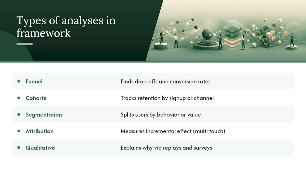
Funnel analysis shows where users drop off between steps, at what conversion rate, and how long each step takes. This is the fastest way to find a single broken screen costing you more than any feature request.

Cohort analysis tracks retention curves by signup date or acquisition channel, revealing cohort velocity and early signals of lifetime value. A cohort that retains worse than the one before it is often the earliest warning of a pricing or onboarding regression.
Segmentation splits users by behavior or value, not just demographics, so you know which segment to prioritize for the next experiment. A “power user” segment defined by usage frequency tells you more than one defined by company size.
Attribution and experimentation connect a change to its actual incremental effect, using multi-touch context rather than crediting the last thing a user clicked. Without this, teams routinely take credit for growth a marketing campaign or seasonal trend already explained.
Qualitative signal covers session replay, surveys, and interview synthesis. Quantitative metrics tell you what happened and how much; qualitative signals explain why it happened, and a framework that skips this half is guessing at causes. A funnel drop-off tells you where; a five-minute session replay often tells you why in seconds.
How to build a product analytics framework step by step
Building the framework in the wrong order is the single biggest reason these projects stall. Start from business outcomes, not from whatever data already exists in your warehouse.
-
Define leadership’s actual questions first. Sit with whoever owns revenue and growth targets and write down the five questions they ask most. Every metric you build later should trace back to one of these questions.
-
Build the KPI map. A KPI map that links each metric to an owner, a data source, calculation logic, and the decision it triggers is the backbone of the whole system. Skip this step and you’re back to dashboards nobody trusts.
-
Design the event taxonomy. Set naming conventions (verb_noun, consistent casing), define required properties for each event, and version the schema so a change doesn’t silently break historical comparisons.
-
Instrument and QA before you trust a single number. Run automated checks for event volume anomalies, schema drift, and duplicate events the moment instrumentation ships, not months later when someone questions a report.
-
Integrate experimentation with pre-registered criteria. Decide the success metric, minimum sample size, and decision rule before an experiment launches. Documenting this in a shared experiment registry tied to the KPI map keeps results from getting relitigated after the fact.
-
Build dashboards around decisions, not data. Every dashboard should map to a named playbook: if this metric drops below X, here’s who looks at it and what they check next.
-
Set a review cadence and prune ruthlessly. Weekly for guardrails, monthly for primary metrics, quarterly for the North Star itself. Any metric that hasn’t triggered a decision in two review cycles gets retired.
Pro Tip: Before you instrument a single new event, write the decision it’s meant to support on the same line in your KPI map. If you can’t state the decision, you probably don’t need the event yet.
Structuring metric trees, targets, and guardrails
A metric tree puts the North Star at the top, the 3 to 5 primary inputs that move it in the middle, and guardrails at the base to catch damage those inputs might cause. Teams should track three to five primary metrics that move the North Star, plus one or two guardrail metrics to prevent chasing growth at the expense of something that matters more, like retention or trust.
Building the tree in practice looks like this:
- Start with the North Star, then ask which 3 to 5 metrics most directly cause it to move.
- Add 1 to 2 guardrails that would catch a metric moving in the wrong direction as a side effect (support tickets, churn, error rates).
- Set thresholds in three bands, green, yellow, and red, based on historical variance rather than a number pulled from a planning meeting.
- Assign a cadence and an owner to each tier: guardrails reviewed weekly, primary metrics monthly, North Star quarterly.
The tree only works if ownership is explicit. A metric with no named owner is a metric nobody will act on when it turns red.
How do you keep instrumentation trustworthy?
Trust in the data breaks down the same way every time: inconsistent event names, undocumented properties, and no one checking for drift until a report looks obviously wrong. Event taxonomy governance, including naming conventions, property standards, and schema versioning, reduces measurement drift and keeps teams trusting the numbers.
A few practices separate frameworks people trust from ones they quietly ignore:
- Assign data stewards responsible for a domain (onboarding events, billing events) who own the data dictionary for that area.
- Document every event’s purpose, properties, and owning team in one searchable place, not scattered across old tickets.
- Run automated checks for event count anomalies, schema drift, and duplicate events, and route failures into a remediation playbook instead of a Slack thread nobody follows up on.
- Bake basic privacy and compliance review into the instrumentation step itself, not as an afterthought once legal notices the new event.
Pro Tip: Give every event owner a five-minute monthly ritual: check the data dictionary entry for their domain and confirm it still matches what’s actually shipping. Drift catches teams off guard because nobody owns the boring maintenance.
Turning dashboards into decisions and action
A dashboard’s job is to prompt action, not to display activity. Design each one around a decision someone actually needs to make, then work backward to the metrics that inform it.
- Cut any dashboard panel that nobody can name a decision for. If it doesn’t inform an action, it’s clutter.
- Set alert thresholds that name who acts and what they’re expected to do, not just a number that turns red.
- Build playbooks that map specific metric moves to a next step: a funnel drop triggers a UX review, a retention dip triggers a cohort deep dive.
- Document every experiment’s setup and outcome in a shared registry so the next team doesn’t rerun a test you already ran.
Closing the loop matters as much as building the dashboard. A team that runs an experiment, sees the result, and never circulates the learning is rebuilding the same insight every quarter.
Common product analytics mistakes to fix now
Run this quick audit against your current setup. Most teams find at least two of these.
- Vanity metrics survive review. Total signups or page views look good in a slide but rarely change a decision, so they stay on dashboards out of habit.
- Too many metrics, no owners. The most common mistake is tracking many metrics without tying them to decisions; metrics that don’t trigger action should be retired, not archived “just in case.”
- Instrumentation drifts silently. An event renamed by one engineer without notice breaks a quarter of historical comparisons before anyone notices.
- Qualitative context gets skipped. Teams read the funnel number but never watch a single session replay or read a single survey response explaining it.
Real-world examples of product analytics frameworks in action
North Star thinking shows up most visibly in companies that picked one metric and refused to let every team define success differently. A well-known example many product teams reference is a “value moment” North Star, something like weekly active collaborators for a workplace tool, rather than raw signups. The metric matters less than the discipline: every roadmap decision gets tested against whether it moves that one number.
On the funnel side, subscription products commonly run AARRR-style breakdowns that separate activation (did the user complete a defined first action) from adoption (did they return without a nudge). Splitting those two stages routinely reveals that a “retention problem” is actually an activation problem: users churn because they never got value in the first session, not because the ongoing product experience is weak.
HEART shows up most often at the feature level. A team shipping a redesigned onboarding flow will typically define task success (did the user complete setup) and happiness (a short in-app survey) as paired metrics, rather than judging the redesign on adoption alone. That pairing catches the case where a flow gets more completions but leaves users more frustrated getting there, a result raw completion rate alone would miss entirely.
The pattern across all of these: the framework choice follows the question, not the other way around. Teams that pick North Star first and back into AARRR or HEART for the inputs tend to end up with fewer, more defensible metrics than teams that start by cataloging everything they could possibly measure.
Aligning the framework with business goals and strategy
A framework disconnected from company strategy turns into an analytics exercise nobody outside the product team cares about. Alignment starts by working backward from the company’s stated goals, whether that’s net revenue retention, expansion revenue, or a specific market share target, and asking which product-level metrics causally connect to them.
This is where the North Star earns its position at the top of the tree. If the company’s strategic goal is expansion revenue, the North Star should be a usage or value metric that’s been shown to correlate with expansion, not just user growth in the abstract. If the goal is efficient growth, guardrails around cost-to-serve or support load matter as much as growth inputs.
Strategy alignment also means revisiting the framework when strategy shifts. A framework built for a land-and-expand motion doesn’t automatically work once the company pivots to a self-serve model; the decision triggers, thresholds, and even the North Star itself may need to change. Treat the framework as a living system tied to the current strategic quarter, not a document you built once and never revisit.
The practical test: can someone trace any metric on your primary dashboard back to a line in the company’s strategic plan in under two sentences? If not, either the metric or the strategy connection needs work.
Who owns what: stakeholder roles in the framework
A framework survives past its first quarter only if ownership is explicit and distributed, not concentrated in one analyst who eventually leaves or gets pulled onto something else.
Product managers own the KPI map for their surface area: which metrics matter, what decision each one triggers, and when a threshold justifies pulling in engineering or design.
Data or analytics engineers own the event taxonomy and instrumentation quality, including the QA checks that catch schema drift before it corrupts a quarter of reporting.
Growth and marketing teams own attribution logic and the acquisition-side metrics feeding the top of the funnel, coordinating with product on where funnel ownership hands off.
Engineering leads own shipping instrumentation correctly and flagging when a code change might silently affect an existing event.
Leadership owns setting the North Star and reviewing it at the agreed cadence, resisting the temptation to add a new metric to every meeting agenda.
Without a named owner for each layer, the framework decays into whoever happens to notice a broken dashboard first.
Practitioner notes: quick wins for low-maturity teams
Prowl was built around a simple observation: most teams don’t struggle to define a KPI map, they struggle to pull the underlying numbers from a dozen disconnected sources fast enough to keep the map current. Automating that cross-source pull is where the real time gets saved.
For a team starting from near zero, three moves compound fast: pick one North Star before building anything else, retire any metric with no named owner, and instrument QA checks before you trust a single dashboard number in a leadership review.
— Sergey
Build and scale your framework faster with Prowl
Every step in this playbook, KPI mapping, cross-source reporting, experiment synthesis, competitive context for your guardrails, takes real analyst hours when done tool by tool. Prowl connects any AI agent or workflow to 444 marketing intelligence tools through one MCP connector, so pulling SEO data, ad performance, competitor moves, and pricing trends into your KPI map doesn’t mean juggling a dozen logins and manual exports.
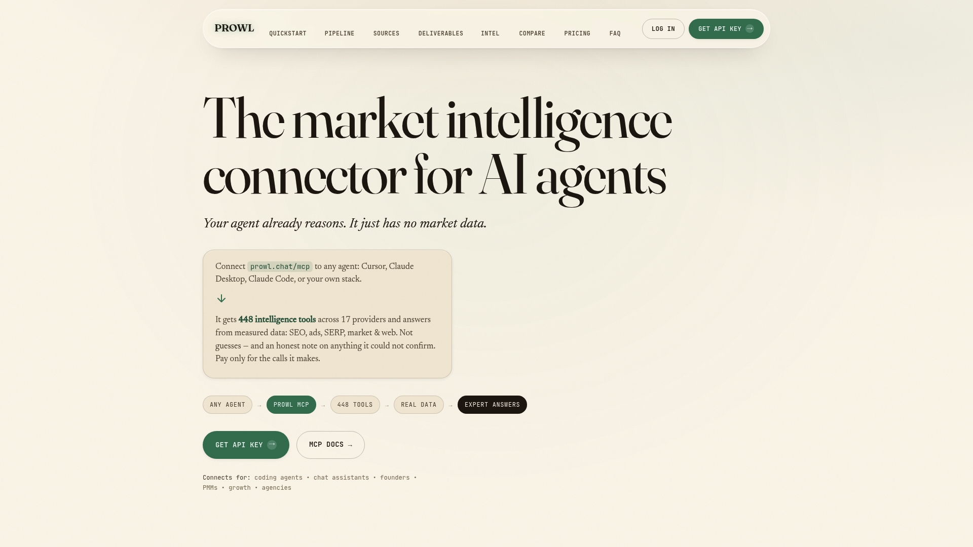
That matters most at the instrumentation and reporting stage, where teams lose the most time reconciling numbers from different sources before a review. Prowl generates real-time analytics reports, funnel and review analysis, and competitive benchmarks in formats your team can drop straight into a dashboard or a leadership deck, including PDFs, infographics, and interactive reports.
If you’re mapping out your KPI structure now, the use cases library shows how other product and growth teams have automated report generation around their own metric trees. When you’re ready to connect it to your workflow, getting started walks through linking Prowl to your agent in one setup pass.
Sources
For deeper detail on KPI mapping and instrumentation patterns, Webeyez’s practical guide covers calculation logic and decision thresholds in depth. ProductPlan’s framework overview is strong on avoiding the vanity-metric trap. For a side-by-side on AARRR, HEART, and North Star mechanics, see Hyperact’s comparison.
- Product Analytics Framework: A Practical Guide for Data-Driven Product Decisions - Webeyez Insights