
Marketing data visualization is the practice of turning raw campaign, funnel, and audience data into charts and dashboards that make a decision obvious instead of buried in a spreadsheet. Done right, a visual should answer a question in under five seconds: is this campaign working? Where is the funnel leaking? Which channel deserves next month’s budget?
You’ll see it doing real work in three places constantly:
- Campaign performance reviews, where a line chart of cost-per-acquisition against spend reveals a channel quietly losing efficiency before finance asks about it.
- Funnel diagnostics, where a conversion-step chart shows exactly which stage bleeds the most traffic.
- Attribution reporting, where stacked contribution charts settle arguments about which touchpoint actually drove the sale.
Platforms like Prowl now let analysts pull live SEO, ad, and competitor data straight into these formats without manually stitching together five different tool exports first.
Key Takeaways
Decision-grade marketing visualization depends on validated data, the right chart for the question being asked, and a repeatable process for building and maintaining every report.
| Point | Details |
|---|---|
| Match chart to question | Use line charts for trends, conversion-step charts for funnels, and avoid pie charts with more than a few slices. |
| Metrics need dimensions | A number alone rarely helps; slice it by channel, region, or time to reveal a pattern. |
| Apply the 3 C’s | Clarity, context, and consistency catch most design mistakes before they mislead a stakeholder. |
| Pair numbers with narrative | Joint displays combine metrics with customer quotes or UX notes to explain why a number moved. |
| Automate the plumbing | Prowl connects 444 marketing intelligence tools through one MCP so teams spend time reading dashboards instead of building data pipelines. |
Table of Contents
- What Makes a Marketing Visualization Actually Decision-Grade?
- How Do Visuals Actually Change Marketing Decisions?
- Which Chart Type Fits Which Marketing Question?
- How Do You Build a Marketing Visualization Step by Step?
- What Type of Visualization Tool Fits Your Team?
- What Design Rules Keep a Marketing Chart Honest?
- How Do You Combine Quantitative and Qualitative Marketing Data Visually?
- What Do Ready-Made Marketing Visualization Templates Look Like?
- What Priorities Actually Move the Needle on Marketing Reporting?
- How Can Prowl Help You Build Marketing Visualizations Faster?
- Frequently Asked Questions
- Sources
What Makes a Marketing Visualization Actually Decision-Grade?
A chart earns the “decision-grade” label when it connects to a real data source, respects the difference between a metric and a dimension, and updates often enough to still be true when someone acts on it. A lot of marketing charts fail this test. They’re pretty, but they’re decorative: built once, never refreshed, disconnected from the system that generated the numbers.
Start with where the data actually comes from. Most marketing visualizations pull from a handful of recurring sources:
- Ad platform APIs (spend, impressions, click-through rate, cost per click)
- Web analytics (sessions, bounce rate, conversion rate, page value)
- CRM and sales data (lead-to-customer rate, deal velocity, revenue by source)
- SEO and organic visibility tools (rankings, share of voice, backlink growth)
The distinction that trips up a lot of new analysts is metrics versus dimensions. A metric is the number you’re measuring, like conversion rate or ad spend. A dimension is the way you slice it: by channel, by region, by device, by week. A chart that reports “conversion rate” alone is nearly useless. A chart that reports conversion rate by channel by week tells a story.
Granularity matters just as much as the split. Daily data shows volatility that monthly data smooths away, and for a fast-moving paid campaign, that volatility is often the signal you need. A dashboard refreshed weekly is fine for content performance; a dashboard refreshed weekly for a live paid social campaign is already stale by the time someone reads it. Match refresh cadence to how fast the underlying channel actually moves, and build in interactivity, filters for date range, segment, and channel, so one dashboard serves five different questions instead of forcing five separate exports.
How Do Visuals Actually Change Marketing Decisions?
The value of a good chart isn’t aesthetic. It’s speed. A well-built visual gets a marketer from “something feels off” to “here’s the specific problem” in a fraction of the time a raw data table takes, because pattern recognition is something the human eye does far faster than the human brain scanning rows of numbers.
That speed shows up in a few concrete ways:
- Faster anomaly detection. A sudden dip in a line chart is visible in half a second. The same dip buried in a spreadsheet might not surface until someone runs a manual comparison days later.
- Better hypothesis generation. Once you see that conversion rate dropped only on mobile, only in one region, the next question writes itself.
- Stronger stakeholder alignment. Executives don’t want raw exports. A single chart that leads with the finding, then supports it with detail, gets budget approved faster than a ten-tab report.
- Clearer story-first reporting. Framing a dashboard around “what happened and what we’re doing about it” rather than “here’s everything we tracked” changes how leadership responds to it.
Quick gut check: if a stakeholder can’t state the takeaway from your chart within ten seconds of seeing it, the chart is doing decoration, not analysis.
The use cases stack up fast once teams get disciplined about this. Campaign optimization dashboards catch underperforming ad sets before they burn through budget. Attribution visuals stop the recurring fight over whether paid search or email gets credit for a sale. Funnel monitors flag a broken checkout step within hours instead of at month end. Content performance grids show which topics are actually pulling organic traffic, so editorial calendars stop guessing.
Which Chart Type Fits Which Marketing Question?
Most marketing dashboards fail not because the data is bad but because the chart type answers the wrong question. Match the chart to the question you’re actually asking, not to what looks most impressive in a deck.
Here’s the mapping that holds up across most marketing use cases:
- Trend over time → line or area chart. Best for spend, traffic, or conversion rate tracked daily or weekly.
- Distribution → histogram or box plot. Useful for understanding the spread of order values or session durations, not just the average.
- Composition → stacked bar, 100% stacked bar, or KPI cards. Good for showing channel mix or budget allocation, as long as the number of categories stays small.
- Relationship between two variables → scatter plot. This is where you’d plot ad spend against conversions to spot diminishing returns.
- Geography → geo map. Regional performance, store traffic, or localized campaign reach.
- Funnel progression → conversion-step chart. Shows exactly where volume drops between stages, which a bar chart alone can’t communicate.
Pie charts deserve a specific warning. They’re the most overused and most misleading chart in marketing decks. The human eye is bad at comparing angles and areas, which means a pie chart with more than three or four slices becomes nearly impossible to read accurately. A stacked bar chart or a simple ranked bar chart almost always communicates the same composition data more clearly. Stacked charts have their own trap too: once you stack more than four or five categories, the middle segments become hard to compare against each other because they don’t share a common baseline. If composition comparison across time is the goal, a 100% stacked bar or small multiples (a grid of simple bar charts) usually beats one crowded stacked chart.
A few design habits separate a usable chart from a confusing one:
- Label the actual data point when there are ten or fewer categories; don’t force the reader to cross-reference a legend.
- Order categorical bars by value, not alphabetically, unless the order itself carries meaning (like funnel stages).
- Use color to encode meaning, not decoration. One accent color for “this is the number that matters” beats a rainbow palette every time.
Pro Tip: Before building any chart, write the one-sentence takeaway you want the viewer to walk away with. If you can’t write that sentence, you don’t know your question well enough to pick the right chart yet.
How Do You Build a Marketing Visualization Step by Step?
A repeatable process beats reinventing the wheel every time someone asks for a new report. This five-step workflow holds up whether you’re building a single chart for a Monday standup or a full dashboard for the quarterly board deck.
- Define the question and audience first. “Show me campaign performance” is not a brief. “Which paid social campaign should get more budget next month, for the growth lead” is a brief. The audience changes the level of detail: executives want the headline, analysts want the breakdown.
- Pull and validate the data, then decide granularity. Check for duplicate rows, missing dates, and currency or timezone mismatches before anything gets charted. Decide whether daily, weekly, or monthly granularity actually serves the question, based on how fast that channel moves.
- Choose the visual and add context. Pick the chart type from the mapping above, then add the layer that makes a number meaningful: a benchmark line, a target threshold, or an annotation marking when a campaign launched or a landing page changed.
- Prototype and test with stakeholders before finalizing. Show a rough version to the actual audience and watch where their eyes go first. If they ask a question the chart should have already answered, that’s your cue to revise it, not explain it verbally.
- Deploy with a refresh schedule and clear ownership. Set the update cadence, decide who gets alerted when a metric crosses a threshold, and document where the data comes from so the next person who touches the dashboard doesn’t have to reverse-engineer it.
Governance matters more than most teams admit. When five different dashboards report five slightly different conversion rates because each one calculates the metric differently, trust in the whole reporting system erodes fast. Building a shared metric layer, the kind of semantic modeling Power BI’s DAX documentation describes for reusable, consistent calculations, solves this by defining each metric once and reusing it everywhere.
Pro Tip: Keep a “definitions” tab or footer on every dashboard listing exactly how each metric is calculated. It takes five minutes to build and saves hours of “why don’t these numbers match” meetings later.
What Type of Visualization Tool Fits Your Team?
The tool question isn’t “which platform is best.” It’s “which category of tool fits the team’s technical resources and reporting scale.” Four broad classes cover almost every marketing use case.
Lightweight reporting tools work well for small teams that need a handful of clean dashboards without engineering support. They connect directly to ad platforms and CRMs with minimal setup.
Marketing BI platforms sit a level up, built for teams juggling multiple data sources who need governed metrics, scheduled reports, and role-based access. These are the tools that matter once more than two or three people are pulling from the same numbers.
Embedded SDKs let product and growth teams bake visualizations directly into an internal app or client-facing portal, useful when the audience needs live access rather than a static report.
Code-first libraries like D3.js give full control over custom, highly interactive visuals embedded on the web, at the cost of needing an engineer or a comfortable analyst who can write JavaScript.
Whichever category fits, run the same evaluation checklist before committing:
- Connectors: does it pull natively from the ad platforms, CRM, and analytics tools you actually use?
- Latency: how fresh is “real-time,” and does that match how fast your channels move?
- Collaboration: can multiple people edit or comment without exporting static screenshots back and forth?
- Export formats: PDF, PPTX, and interactive links all serve different stakeholders; check what’s actually supported.
- Governance: is there a shared metric layer, or will every user define “conversion rate” their own way?
- Cost model: seat-based pricing punishes growing teams; usage-based pricing can punish spiky reporting needs. Know which fits your actual usage pattern.
Selection criteria like connectors, customization, and scalability are exactly what Domo’s guidance for marketers points to as the difference between a tool that scales with a growing marketing function and one the team outgrows within a year. Small teams generally do better starting with a lightweight, connector-rich tool and graduating to a governed BI layer once more than two teams depend on the same numbers. Enterprise analytics teams usually need the governance and semantic modeling from day one, since inconsistent metrics across a large org create far more damage than a slightly slower rollout.
What Design Rules Keep a Marketing Chart Honest?
Most visualization mistakes trace back to violating one of three basic rules commonly summarized as the “3 C’s”: clarity, context, and consistency. A chart that breaks even one of these will mislead someone eventually, even if the underlying data is accurate.
Clarity means the viewer shouldn’t have to work to find the point.
Context means a number never stands alone. A conversion rate of 3.2% means nothing without a benchmark, a prior period, or a target to compare against. Annotations marking campaign launches, algorithm updates, or seasonal spikes turn a flat line into an explanation.
Consistency means the same metric always looks the same way across every report. If cost-per-acquisition is green-good-low in one dashboard and red-good-low in another, you’ve built confusion into the reporting system itself. This is the design guidance most practitioners across the visualization field converge on regardless of industry.
Color deserves its own attention in marketing specifically, since brand palettes rarely double as accessible data palettes. A vibrant brand green might read fine on a homepage but fail contrast standards on a chart legend, and roughly 8% of men have some form of color vision deficiency, which makes red-green comparisons a common accessibility trap in campaign dashboards. Swap to a colorblind-safe palette (blue-orange pairings work reliably) for anything shared broadly.
Before publishing any chart, run this checklist:
- Every axis and data point is labeled clearly
- The data source and date range are stated somewhere on the visual
- The unit of measurement (%, $, count) is unambiguous
- Any sampling limitation or data gap is noted, not hidden
How Do You Combine Quantitative and Qualitative Marketing Data Visually?
The gap most marketing dashboards never close is the “why.” A funnel chart shows conversion dropped, but it can’t tell you customers found the new checkout flow confusing. That’s where joint displays earn their place in a marketing analyst’s toolkit.

A joint display is a visual matrix that arrays quantitative results directly beside qualitative themes, letting a viewer scan across a row and see the number and the reason in the same glance. Research on mixed-methods analysis found that statistics-by-themes and side-by-side joint displays are the most common formats, and that they generate inferences neither the numbers nor the text alone would produce. Joint displays remain underused in marketing specifically, even though pairing a metric with a customer quote or a UX note in one matrix is one of the highest-return ways to explain why a number moved.
Two layouts cover most marketing needs:
| Layout | Best For |
|---|---|
| Statistics-by-themes matrix | Pairing NPS or churn rate with recurring themes from support tickets or reviews |
| Side-by-side comparison | Showing funnel-stage drop-off next to session-recording or usability-test notes for that same stage |
The construction detail that matters most: align your qualitative themes to the same categorical buckets you’re already using in the quantitative analysis, like “pricing,” “usability,” and “messaging,” so a row-by-row scan reveals the pattern without any recoding work afterward.
Pro Tip: Before presenting a joint display, validate the pairing by checking whether the qualitative theme actually co-occurs with the metric shift in the same time window. A theme from six months ago paired with this month’s number isn’t an integrated inference, it’s a coincidence.
What Do Ready-Made Marketing Visualization Templates Look Like?
Three outlines cover most recurring marketing reporting needs, and each one is worth building once as a reusable template rather than rebuilding from scratch every cycle.
- Campaign performance dashboard: spend, CPA, ROAS, and conversion rate as line charts by week, refreshed daily for active paid campaigns, with a KPI card row up top for the current-period headline numbers.
- Conversion funnel one-pager: a single conversion-step chart showing volume at each stage, paired with the percentage drop between stages and one annotation explaining the biggest leak.
- Audience segmentation snapshot: a stacked bar of audience composition by segment, filterable by campaign and date range, built to answer “who is actually converting” in one view.
Export each as both an interactive link for analysts and a static PDF for executives who just want the headline.
What Priorities Actually Move the Needle on Marketing Reporting?
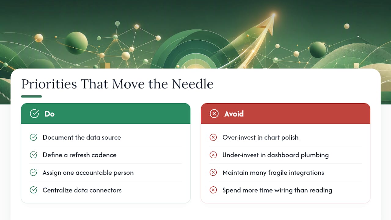
Most marketing teams over-invest in chart polish and under-invest in the plumbing that keeps a dashboard accurate six months after launch. The reports that hold up aren’t the prettiest ones, they’re the ones with a documented data source, a defined refresh cadence, and one person accountable for catching when a connector breaks.
Centralizing data connectors changes how fast that plumbing gets built. When every analytics, ad, and SEO tool needs its own separate integration, teams spend more time wiring pipes than reading charts. That’s the operational gap something like the Prowl MCP approach is built to close, by giving an analyst one connection point across hundreds of intelligence tools instead of a dozen fragile ones.
How Can Prowl Help You Build Marketing Visualizations Faster?
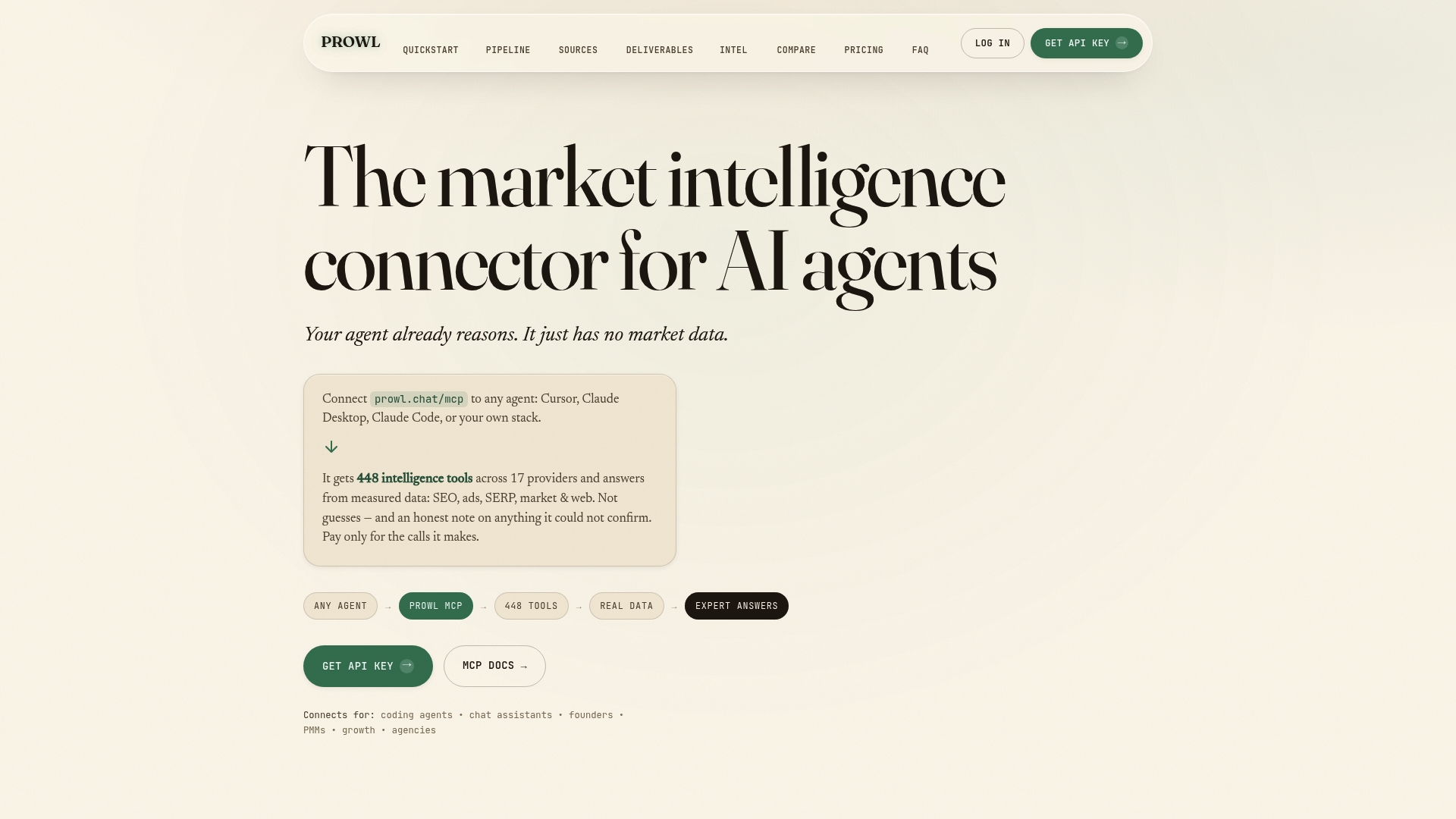
Building the reporting workflow described above usually means wiring together five or six separate tools before a single chart gets drawn: one for ad data, another for SEO, another for competitor tracking. Prowl collapses that setup into a single connection point. Through the Prowl MCP, any AI agent or workflow gets access to 444 marketing intelligence tools, covering SEO tracking, ad performance, competitor analysis, and funnel data, without configuring each one separately.
That single connection turns into real report output fast. A team that needs a recurring campaign performance dashboard can automate the data pulls and export formats they already rely on, whether that’s a scheduled PDF for leadership or an interactive report for the analyst team, instead of manually refreshing spreadsheets every Monday morning. If you’re evaluating how this fits into an existing workflow, the getting-started guide walks through connecting an agent to the MCP and running a first live report in minutes, not days.
Frequently Asked Questions
What is marketing data visualization used for? It turns campaign, funnel, and audience data into charts that let marketers spot problems, compare channels, and justify budget decisions faster than reading raw spreadsheets.
What’s the most common mistake in marketing dashboards? Using a pie chart or overcrowded stacked chart for composition data with too many categories, which makes accurate comparison nearly impossible for the viewer.
How often should a marketing dashboard refresh? It depends on the channel. Fast-moving paid campaigns often need daily refreshes, while SEO or content performance dashboards can run on a weekly cadence without losing relevance.
What is a joint display in marketing analytics? A joint display is a matrix that places quantitative metrics beside qualitative themes, like customer quotes or support ticket topics, so a viewer can see the number and the reason together.
Do marketing teams need a dedicated BI platform? Small teams often start fine with lightweight reporting tools; a governed BI platform becomes worth the investment once multiple teams depend on the same metrics and need consistent definitions.
Sources
- Integrating quantitative and qualitative results in health science mixed methods research through joint displays - PMC
- 10 Best Data Visualization Tools for Marketers - Domo
- D3.js