
Customer journey analytics is the practice of tracking real customer behavior, purchases, and interactions across every touchpoint, then converting those patterns into measurable business decisions. It doesn’t guess what customers might do. It measures what they actually did, where they stalled, and what fixing that stall is worth.
The payoff shows up in three places: fewer silent revenue leaks in the funnel, a prioritized list of what to fix first instead of a hundred equally urgent ideas, and a measurable lift you can point to after you act. That last part matters most. A 2026 Salesforce report found that 88% of customers now weigh their experience with a company as heavily as the product itself, which is exactly why CSAT, NPS, and CES have become board-level metrics instead of support-team trivia.
The single next action: pick one decision this quarter, name it in one sentence, and let the data decide it. If you can’t state the decision, you’re not ready to build the dashboard yet.
Key Takeaways
Customer journey analytics turns raw behavioral data into a prioritized, measurable backlog of fixes, and it only works when every stage is tied to a named decision.
| Point | Details |
|---|---|
| Name the decision first | Write one sentence stating what this analysis will decide before building any dashboard. |
| Mark data confidence | Tag each journey stage green, yellow, or red and validate yellow stages before acting on them. |
| Separate anonymous and identified journeys | Avoid forcing weak identifiers to stitch pre-login and post-login data together. |
| Pair numbers with qualitative checks | Use interviews or session recordings to explain the “why” behind a metric shift. |
| Use one connector for evidence gathering | Prowl links 444 intelligence tools through one MCP so analysts can generate stakeholder-ready reports without juggling separate platforms. |
Table of Contents
- What Does Customer Journey Analytics Actually Measure?
- Customer Journey Analytics vs. Customer Journey Mapping: What’s the Difference?
- What Business Benefits Does Journey Analytics Deliver?
- How Do You Build a Customer Journey Analytics Program in Seven Steps?
- Which Metrics Actually Tell You Something Useful?
- Which Tools Handle Journey Analytics, and What Should You Demand From Them?
- What Goes Wrong Most Often With Journey Analytics?
- How Do Experienced Teams Keep Journey Analytics From Fading Out?
- How Prowl Speeds Up Journey Analytics Reporting
- Frequently Asked Questions
- Sources
What Does Customer Journey Analytics Actually Measure?
Customer journey mapping analytics work by stitching individual touchpoints (an ad click, a support ticket, a cart abandonment, a login) into full paths tied to outcomes like conversion, renewal, or churn. A map tells you what you think happens. Analytics tells you what happened to 40,000 real people last month, and how many of them made it to the next step alive.
The output isn’t a single chart. A working setup typically produces:
- Path rankings showing which sequences of touchpoints most often end in a sale or a cancellation
- A funnel leakage table pinpointing the exact step where volume drops hardest
- Cohort retention charts comparing how different signup groups behave three, six, and twelve months out
- A prioritized backlog of fixes ranked by expected impact, not by whoever argued loudest in the meeting
Here’s a compact example. Journey analytics aggregates these paths, funnels, and cohorts into measurable flows tied to outcomes, so the team isolates that cohort, moves the permissions step earlier, and re-measures. Trial-to-paid conversion for that cohort rises 6 points in five weeks. That’s the entire discipline in miniature: find the leak, test a fix, measure the cohort, keep or kill it.
Customer Journey Analytics vs. Customer Journey Mapping: What’s the Difference?
A journey map is a hypothesis. Journey analytics is the evidence that proves or breaks that hypothesis. Confusing the two is the most expensive mistake a CX team makes, because a wall covered in sticky notes feels like progress even when nothing behavioral backs it up.

| Dimension | Customer Journey Mapping | Customer Journey Analytics |
|---|---|---|
| Purpose | Align teams on a hypothesized experience | Measure what customers actually do |
| Cadence | Built once, revisited occasionally | Continuous and longitudinal |
| Scale | A handful of personas or segments | Every session, every cohort |
| Typical output | Diagram, workshop artifact | Funnels, cohorts, attribution, dashboards |
| Main limit | Goes stale fast, easy to rationalize | Explains “what,” rarely “why” alone |
The rule of thumb: update the map when analytics shows a pattern the map never predicted, and rebuild the map’s assumptions whenever the underlying data shifts, not on a fixed annual schedule. Most journey maps end their working life as workshop wall art precisely because nobody tied them to a data source or a decision. A map without a name, a decision, and a data feed is decoration, not strategy.
What Business Benefits Does Journey Analytics Deliver?
Every benefit below ties to a KPI you can put in a board deck, not a vague promise about “understanding customers better.”
- Reduced churn. Spotting the exact usage pattern that precedes cancellation lets you intervene weeks before the exit, not after the exit survey.
- Higher conversion efficiency. Fixing the single biggest funnel leak usually moves conversion more than five smaller tweaks combined.
- Sharper product and UX prioritization. A ranked backlog based on drop-off volume beats a backlog based on internal opinion, every time.
- Smarter marketing spend. Attribution tied to real paths shows which channels feed customers who actually stick around, not just ones who click.
- Better retention and CLV. Cohorts that hit a specific milestone early (a second purchase, a feature adopted in week one) show measurably higher lifetime value.
A concrete version: an ecommerce team finds that customers who don’t engage with post-purchase email within 48 hours churn at nearly double the rate of those who do. They automate a targeted nudge at hour 36. Ninety days later, 90-day retention for that cohort improves measurably, and the team can show the finance team exactly which lever moved it. That’s the difference between “we improved the experience” and “we improved 90-day retention by acting on hour 36.”
How Do You Build a Customer Journey Analytics Program in Seven Steps?
This is the operational sequence, not a workshop agenda. Skip a step and you’ll end up with a beautiful dashboard nobody trusts enough to act on.
- Define the decision and outcome. Write one sentence: “This analysis will decide whether we redesign the onboarding flow.” No sentence, no project.
- Inventory your data and mark confidence. List every source feeding the journey (web analytics, CRM, support tickets, billing) and tag each stage green, yellow, or red based on how much you actually trust it.
- Choose your identity approach. Decide upfront whether you’re stitching logged-in users only, or attempting cross-device resolution, and accept the tradeoffs that come with each.
- Instrument the events that matter. Track the handful of actions that actually predict the outcome you named in step one, not every click available.
- Unify and model the journeys. Assemble paths across systems into a single timeline per customer or cohort, respecting the identity boundaries you set in step three.
- Diagnose the top leaks with both numbers and people. Quantify where drop-off is worst, then run five to ten customer interviews or review session recordings on that exact segment. Analytics reliably shows the “what” and “when,” but pairing it with qualitative validation is what surfaces the “why”.
- Prioritize, act, measure, and set a cadence. Score each opportunity by impact, confidence, and effort, ship the top few, measure the outcome against a holdout or prior cohort, and revisit the whole map quarterly or whenever pricing or product shifts materially.
Governance is what separates a real program from a one-off analysis. Assign an owner to each journey stage, not just to the dashboard. Enterprise journey teams treat decision governance, not the chart itself, as the missing layer that determines whether fixes actually move the business or just look good in a slide.
Pro Tip: Name the decision before you touch the data. Skip the naming step and you’ll analyze forever without deciding anything.
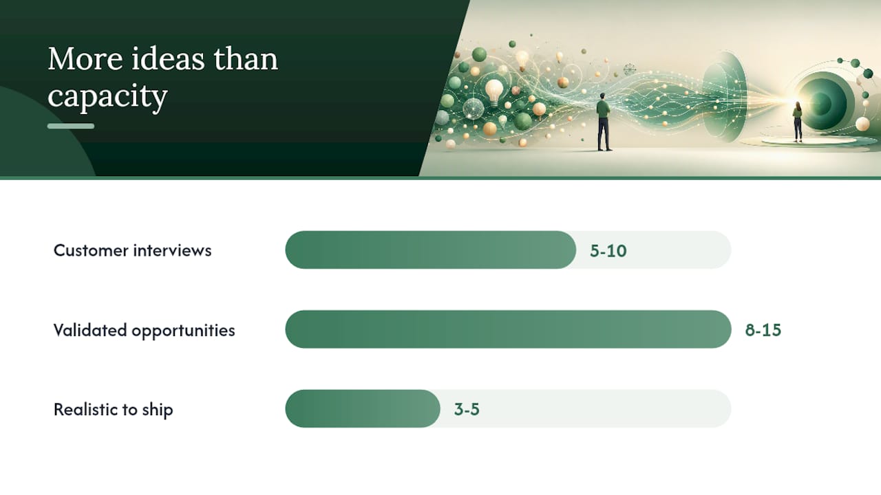
A healthy first quarter typically produces a backlog of 8 to 15 validated opportunities, with 3 to 5 realistic to ship before the next review. That’s a feature, not a shortfall. Analytics is supposed to surface more good ideas than you can execute at once.
Which Metrics Actually Tell You Something Useful?
Not every metric earns a place on the dashboard. These do, and each one points to a specific follow-up question:
- Conversion rate — signals whether a step is working; a sudden drop means diagnose that exact step first.
- Churn rate — flags retention health; segment by cohort before assuming one cause fits all.
- Customer lifetime value (CLV) — shows whether acquisition spend is actually paying off long-term.
- CSAT — captures satisfaction at a single moment; useful right after a support interaction or purchase.
- NPS — measures broader loyalty and referral likelihood, best tracked quarterly, not daily.
- CES (Customer Effort Score) — often predicts churn better than satisfaction does, since effort frustrates people faster than mild dissatisfaction.
- Funnel drop-off percentage — pinpoints the exact step losing the most people.
- Time-to-value — measures how fast a new customer reaches their first real win.
None of these explain motive on their own. Pair a drop in CES with a handful of support transcripts or session recordings from that same week, and the number turns into an actual story you can act on.
Which Tools Handle Journey Analytics, and What Should You Demand From Them?
Vendors group this space into a few functional categories: customer data platforms (CDPs) that unify identity, behavioral analytics tools that track event sequences, attribution engines that connect spend to outcomes, BI platforms for reporting, journey orchestration tools that trigger actions, identity-resolution services, and dedicated qualitative research tooling. Evaluation guidance from the space consistently points to identity capability, real-time versus batch processing, and integration depth as the deciding factors.
Before committing budget, demand answers on: identity-matching accuracy, whether the platform processes events in real time or on a delay, how it scales with data volume, total cost of ownership beyond the sticker price, audit trails for governance, and clear data lineage. Favor tools with open data models and straightforward export paths. Lock-in is the quiet cost nobody notices until year two.
What Goes Wrong Most Often With Journey Analytics?
Analytics gives you confidence, and confidence is exactly what gets misused. The recurring failure modes:
- Intent inference errors — assuming a click means interest, when it might mean confusion. Mitigation: validate with a handful of user interviews before rebuilding anything.
- Attribution overconfidence — crediting the last touchpoint when three earlier ones did the real work. Mitigation: test with multi-touch models, not last-click alone.
- Forced cross-device stitching — merging anonymous and identified data with weak identifiers, producing journeys that never actually happened. Mitigation: separate the two objects, as covered above.
- Ignoring the “dark middle” — the long, unmeasured stretch between initial interest and final decision where customers do their own research elsewhere.
- Maps becoming wall art — a diagram nobody updates because it was never tied to a decision or a data source.
One team once saw a spike in NPS after a UI redesign and declared victory. A round of follow-up interviews revealed the score jumped because the survey timing shifted, not because satisfaction actually improved. The metric wasn’t wrong. The interpretation was.
How Do Experienced Teams Keep Journey Analytics From Fading Out?
Programs stick when they’re governed like a discipline, not run like a one-time audit. Assign an owner to every journey moment that matters, and measure whether a fix moved the needle, not whether the team stayed busy. A quarterly review cadence, a simple scorecard per journey stage, and small gated experiments beat a sprawling annual project every time. When identity resolution or attribution modeling gets genuinely technical, that’s the moment to bring in specialist tooling or outside expertise rather than forcing it in-house.
How Prowl Speeds Up Journey Analytics Reporting
Building the evidence base for journey decisions usually means jumping between a CDP, a BI tool, an attribution platform, and a stack of spreadsheets before you can even start diagnosing a leak. Prowl collapses that setup into one connector: a single MCP linking 444 market-intelligence tools lets your agent or workflow pull competitor benchmarks, funnel and review data, and pricing trends into one stakeholder-ready report instead of five disconnected exports.

This fits business analysts, growth teams, and marketing agencies who need repeatable evidence fast, not another dashboard to babysit. If you’re stitching together journey diagnostics manually right now, check the use-case library for report templates close to what you’re already trying to build, then follow the getting-started guide to connect Prowl to your existing agent and generate your first report today.
Frequently Asked Questions
What is customer journey analytics in simple terms? It’s the practice of measuring how real customers move across touchpoints (ads, site visits, purchases, support calls) and connecting those paths to business outcomes like conversion or churn.
Is customer journey analytics the same as customer journey mapping? No. Mapping is a hypothesis about the experience, usually built in a workshop. Analytics is the behavioral evidence that confirms or overturns that hypothesis.
What metrics should a beginner track first? Start with conversion rate, churn rate, and funnel drop-off percentage, since these three point directly at where to focus your first diagnostic effort.
How does identity stitching affect journey analytics accuracy? Weak stitching between anonymous and logged-in data produces journeys that never actually happened. Treating anonymous and identified sessions as separate objects, joined only at clear conversion gates, keeps the analysis honest.
Do I need a large data team to start a journey analytics program? No. You need one named decision, a handful of trustworthy data sources, and a quarterly review habit. Scale the team once the first few fixes prove measurable impact.
Sources
Different journey stages lean on different evidence. Awareness runs mostly on behavioral and ad data. Consideration adds transactional signals like cart activity. Onboarding and retention lean on operational data (support tickets, usage logs) plus attitudinal surveys. Churn and win-back benefit most from qualitative interviews, because the numbers alone rarely explain why someone left quietly.
- Salesforce blog: customer experience
- Customer Journey Map: Analytics Framework That Works — Systems Architect
- Customer Journey Analytics: From Maps to Decisions | Perspective AI
- Customer journey visualization and practice — Userpilot
Stitching those sources into one identity is where most programs quietly fail. Field-based stitching (matching on email or user ID) is reliable but only works once someone logs in or converts. Graph-based stitching (probabilistically linking devices and sessions) covers more ground but introduces error, especially across shared devices. Gate-based stitching converts anonymous sessions into identified ones at a specific moment, like a signup or a webinar registration.
A common and costly mistake is forcing anonymous website traffic to merge with post-login product data using weak identifiers. The better practice: treat the anonymous funnel and the identified journey as two separate analytical objects, connected only at explicit conversion gates.
Pro Tip: Mark every stage’s confidence level green, yellow, or red before you draw a single conclusion. A yellow stage that’s high-impact deserves a quick qualitative validation pass before you bet a roadmap on it, not a leap of faith.