
Most websites convert somewhere between 1% and 4%, and if you’re staring at a number outside that band, the fix isn’t a vague redesign, it’s segmentation. The right question is never “is 2.3% good?” It’s “is 2.3% good for a mid-market SaaS trial signup coming from paid search on mobile?” That’s the only comparison that means anything.
A few anchor points make this concrete. Unbounce’s benchmark report puts the median conversion rate for dedicated landing pages at about 6.6% across industries, with email traffic converting far above everything else. Statista’s 2026 industry dataset shows ecommerce subsectors like beauty and skin near 2.4%, with the sampled sector average closer to 1.4%. And funnel-stage aggregators like ConversionBench break these numbers down further into percentiles, so you’re not just comparing your rate to one average, you’re seeing where you fall in a distribution.
The rule that actually works: compare your rate against the same industry, the same primary channel, the same device split, and the same funnel stage. Cross-industry averages are close to useless for decision-making, they just tell you the shape of the internet, not the shape of your business.
- Sitewide averages typically run 1% to 4%, depending on business model and traffic mix.
- Dedicated landing pages median around 6.6% because they strip out navigation and off-topic distractions.
- Email consistently outperforms many other channels, often landing at relatively high conversion rates in benchmark data.
- Funnel stage changes everything: a “conversion” on a lead-gen form means something very different than a completed ecommerce checkout.
Quick stat: Legal services benchmarks run as high as 7.4% in one 2026 industry breakdown, while luxury ecommerce sits closer to 0.8%. Same internet, wildly different buying psychology.
Key Takeaways
Benchmark conversion rates only become useful once you compare your rate against the same industry, channel, device, and funnel stage rather than a single blended average.
| Point | Details |
|---|---|
| Segment before you judge | Compare your rate by industry, channel, device, and funnel stage, never against a blanket average. |
| Know your median vs. mean | Landing page benchmarks (6.6% median) and sitewide averages (2.35%) measure different things entirely. |
| Channel gaps are the biggest lever | Email converts near 19.3% while cold social lags far behind, prioritize warm-channel optimization first. |
| Fix mobile friction first | Checkout speed, form length, and payment options close most of the device conversion gap. |
| Use Prowl for live segmentation | Prowl pulls real-time, segmented benchmark data across industry, channel, and device instead of relying on static annual reports. |
Table of Contents
- Snapshot: Global Averages and What They Actually Tell You
- Conversion Rate Benchmarks by Industry
- Conversion Rates by Traffic Channel
- Conversion Rates by Device: Desktop, Tablet, and Mobile
- How to Calculate Conversion Rate Correctly
- What Actually Drives Conversion Rate
- How to Turn Benchmarks Into Real CRO Targets
- Where These Benchmark Numbers Actually Come From
- How Marketers Actually Use These Numbers Day to Day
- Getting Live, Segmented Benchmarks Instead of Static Reports
- Sources
Snapshot: Global Averages and What They Actually Tell You
The 2026 industry data puts the overall sitewide average near 2.35%, according to Krishaweb’s breakdown, while landing pages built for a single offer land considerably higher, around that 6.6% median from Unbounce. That gap alone is the first lesson: don’t compare your homepage traffic to a purpose-built landing page campaign. They’re different animals wearing the same “conversion rate” label.
Three variables explain almost all the spread you’ll see across benchmark reports:
- Industry. Buying a $40,000 software contract behaves nothing like buying a $12 phone case.
- Channel. Someone who clicked an email you sent is a warmer lead than someone who saw a cold display ad.
- Device. Mobile checkout friction alone can cut conversion in half compared to desktop for the same offer.
If your rate sits under 1% on traffic you’d call high-intent (branded search, email clicks, retargeting), that’s rarely a “we need better copy” problem. It usually means something structural: a broken funnel step, a message mismatch between ad and landing page, or junk traffic inflating your visitor count without adding real prospects. Diagnose the traffic quality before you touch the design.
Conversion Rate Benchmarks by Industry
Industry benchmarks vary enormously, and the biggest mistake marketers make is grabbing a single “average conversion rate” number and applying it everywhere. A 2% rate might be mediocre for subscription boxes and outstanding for enterprise software trials. Here’s how the major categories typically stack up, drawing on the Statista, Unbounce, and Krishaweb datasets.
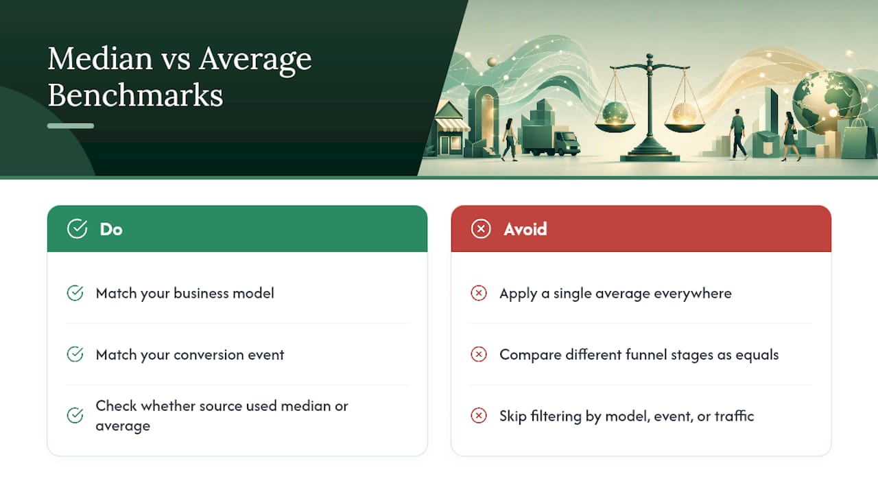
Notice the median-versus-average distinction baked into that table. Medians resist skew from outlier pages; a handful of viral landing pages converting at 40% won’t drag a median the way they’d drag a mean. When you’re pulling a benchmark to compare yourself against, check whether the source used median or average, because the two numbers can tell very different stories from the same dataset.
Pro Tip: Don’t just match your industry category. Match your conversion event too. A B2B services company benchmarking “form submission” against another company’s “completed purchase” is comparing two different funnel stages wearing the same word.
To narrow to a useful peer group, filter on three things: your business model (subscription, one-time purchase, lead generation), your specific conversion event (trial start, demo request, checkout completion), and your dominant traffic mix (are you mostly paid, organic, or referral?). Skip any of those three and your benchmark comparison is decoration, not diagnosis.
Conversion Rates by Traffic Channel
Channel is where benchmark comparisons get genuinely useful, because the swings here dwarf almost anything else in the data. Unbounce reports email as the highest-converting channel, averaging around 19.3%, which makes sense when you consider that someone opening your email already knows who you are and chose to engage.
Lucky Orange’s summary highlights that Google Ads conversion rates are often above typical site averages, a useful anchor if you’re running paid search and wondering whether your account is underperforming or just sitting at the norm.
The reason for these gaps comes down to three things: intent, message match, and audience warmth. Someone clicking an email link already trusts your brand enough to open the message. Someone scrolling past a cold social ad wasn’t looking for you at all, they were looking at photos from a friend’s trip. Closing that intent gap is the entire job of paid social creative, and it’s why cold social campaigns almost always convert lower than search.
- Cold social and cold display sit at the bottom of almost every channel benchmark.
- Retargeting campaigns close much of that gap because the audience already has some familiarity with your brand.
- Referral traffic quality depends entirely on where it’s coming from, a link from an industry publication converts very differently than one from a random forum.
Pro Tip: If you’re resource-constrained, fix message match on paid search first. It’s usually the fastest, cheapest lift because the audience is already looking for what you sell, they just need the landing page to say the same thing the ad promised.
Conversion Rates by Device: Desktop, Tablet, and Mobile
Mobile traffic dominates volume for most sites now, but it still tends to convert below desktop across nearly every industry benchmark. Tablets usually land somewhere in between, though tablet’s overall traffic share keeps shrinking, making it the least useful device for benchmarking decisions.
The typical pattern:
- Desktop conversion rates run highest, particularly for higher-consideration or higher-ticket purchases.
- Mobile trails desktop, sometimes by a meaningful margin, especially on ecommerce checkout flows.
- Tablet sits in between but carries too little traffic share on most sites to warrant heavy optimization focus.
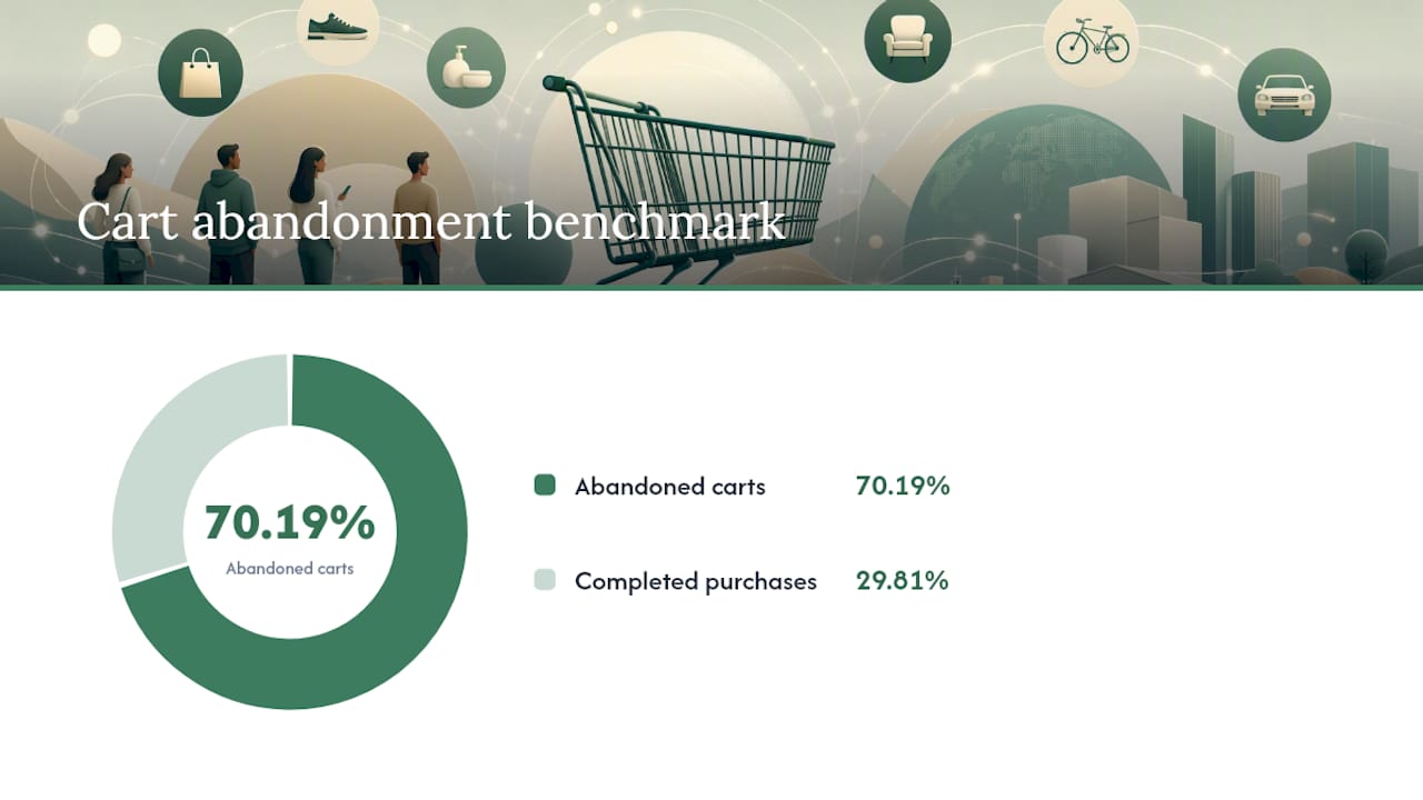
Quick stat: Cart abandonment averages close to 70.19% according to Baymard’s long-run data cited by ConversionBench, and mobile checkout friction is one of the biggest contributors to that number industry-wide.
Why does the mobile gap persist even as mobile traffic keeps growing? Checkout friction is the usual suspect: smaller screens make forms harder to fill out, saved payment methods aren’t always available, and users are more likely to bail on a slow-loading page when they’re on a spotty connection. There’s also a session-behavior difference, mobile users frequently research on their phone and complete the purchase later on desktop, which means mobile “conversion rate” sometimes understates mobile’s real contribution to revenue.
When your device gap exceeds what’s typical for your industry, work through this priority list before touching anything else:
- Checkout speed. Test load time on 4G, not just office WiFi.
- Form length. Every extra field on mobile costs you more than the same field costs on desktop.
- Payment options. Digital wallets (Apple Pay, Google Pay) reduce friction more on mobile than anywhere else.
- Session continuity. Check whether users are abandoning mobile carts and returning later on a different device, that’s not necessarily lost revenue.
How to Calculate Conversion Rate Correctly
The base formula is simple: divide total conversions by total visitors (or sessions), then multiply by 100. Where marketers get it wrong isn’t the math, it’s the definition of “conversion” and the choice of denominator.
- Visitor-to-purchase (ecommerce). Completed orders divided by unique visitors. If 3,000 people visit your store and 60 buy, that’s a 2% conversion rate.
- Visitor-to-lead (B2B). Form completions divided by unique visitors. 500 visitors, 15 form fills, that’s 3%.
- Click-to-conversion (paid ads). Conversions divided by ad clicks, not impressions. This isolates how well your landing page performs once someone’s already interested enough to click.
A quick numeric example makes the pitfalls obvious. That’s a meaningful difference for deciding whether your funnel needs work or your traffic sourcing does.
Common calculation mistakes to check before you trust any number:
- Using sessions instead of unique visitors (or vice versa) inconsistently across time periods.
- Mixing multiple conversion goals into one “conversion” bucket (a newsletter signup and a $500 purchase are not the same event).
- Ignoring bot traffic, which can quietly inflate your visitor count and deflate your rate.
- Comparing a period with a big traffic spike (viral post, PR mention) against a normal period without adjusting for the mix shift.
What Actually Drives Conversion Rate
Benchmarks tell you where you stand. They don’t tell you why. The gap between your number and your target usually traces back to a short list of drivers, and the fastest diagnostic work starts here.
- Traffic quality and intent. A visitor who searched “buy running shoes size 10” converts differently than one who clicked a generic banner ad.
- Message match. If your ad promises a discount and your landing page doesn’t mention it above the fold, you’ll lose people in seconds.
- UX friction. Slow load times, confusing navigation, and multi-step forms all bleed conversions quietly.
- Trust signals. Reviews, testimonials, and social proof measurably affect purchase decisions, and research on review influence backs this up directly.
- Price and average order value. Higher price points naturally convert at lower rates but often make up for it in revenue per conversion.
- Purchase frequency. A grocery delivery service should expect a very different rate than a mattress company, because one is a weekly habit and the other is a once-a-decade purchase.
When you’re trying to figure out which of these is actually the problem on your site, check these analytics signals first: bounce rate on your top landing pages, average session duration for converting versus non-converting visitors, and where exactly in your funnel people drop off.
Pro Tip: Build a simple symptom-to-cause map before you run any test. Low traffic + low conversion usually means audience mismatch. High traffic + low conversion usually means message or UX friction. High traffic + high bounce on one specific page usually means that page, and only that page, needs attention.
How to Turn Benchmarks Into Real CRO Targets
Benchmarks are useless if they just sit in a report. Here’s the practical path from “we know the industry average” to “we have a target and a test plan.”
- Pick your real peer group. Match industry, primary channel, device split, and conversion event as closely as you can. A B2B SaaS company benchmarking against ecommerce data is comparing apples to circuit boards.
- Adjust for your specific mix. If 70% of your traffic is mobile and your industry benchmark is sitewide (blending all devices), your realistic target should skew toward the mobile-weighted number, not the blended average.
- Set a short-term target and a medium-term target. A jump from 1.8% to 2.5% in a quarter is realistic for message-match fixes. A jump to 4% might be a two-quarter goal that requires checkout redesign.
- Prioritize tests with impact × confidence × effort. Score each proposed test on all three, then run the highest-scoring, lowest-effort tests first.
For prioritization, sort your test backlog into three tiers:
- Quick wins: headline and CTA copy tests, form field reduction, adding trust badges near checkout. Low effort, often meaningful impact.
- Medium investment: checkout flow redesign, mobile payment options, page speed optimization.
- Long-term bets: personalization engines, dynamic content platforms like Dynamic Yield, or full funnel re-architecture.
Closing half that gap (to roughly 2.15%) through checkout friction fixes alone, given that cart abandonment averages nearly 70%, is a realistic first-quarter goal. Recovering even a modest share of abandoned carts through streamlined checkout and remarketing emails can move the needle faster than a full redesign would.
Where These Benchmark Numbers Actually Come From
Every benchmark figure in this article traces back to a handful of primary sources, and knowing what each one measures matters more than memorizing the numbers themselves.
| Source | What it measures | Best used for |
|---|---|---|
| Unbounce | Dedicated landing page performance | Campaign-level, single-offer conversion benchmarks |
| Statista | Sitewide ecommerce conversion by sector and device | Industry and device-level context |
| ConversionBench | Aggregated funnel-stage percentiles | Comparing where you fall in a distribution, not just an average |
| Lucky Orange | General site conversion ranges and channel averages | Quick sanity check on “is my rate normal” |
| Krishaweb 2026 breakdown | Cross-source industry synthesis | Cross-checking sitewide averages against multiple reports |
A few caveats matter more than the numbers themselves. Median and mean tell different stories, ConversionBench’s own guidance stresses that landing page reports often lean on medians precisely because a handful of outlier pages can otherwise distort the picture. Sample size and recency matter too: a benchmark pulled from a small dataset last updated three years ago tells you less than a current, larger sample. Geography matters as well, conversion behavior in one region doesn’t automatically transfer to another, and most public benchmark reports blend regions together unless stated otherwise.
If public benchmarks feel too generic for your specific situation, industry panels and platform-based dashboards (tools like Lucky Orange for heatmap-driven behavioral data, or Dynamic Yield for personalization-focused testing) can generate custom, live figures specific to your actual traffic. That’s a meaningful step up from a static report when you need numbers that reflect your exact funnel today, not an industry average from a sample you’ll never see.
How Marketers Actually Use These Numbers Day to Day
Benchmarks earn their keep the moment someone uses them to settle an argument.
The practical move is to start tracking channel and device splits separately this week, not just the blended sitewide rate. Defer anything involving a full redesign until you’ve confirmed the fix targets the actual bottleneck, not just the symptom that shows up in the top-line number.
One honest expectation worth setting: most legitimate CRO experiments produce single-digit percentage lifts, not overnight doublings. That’s a real, compounding win, even though it won’t make headlines.
Getting Live, Segmented Benchmarks Instead of Static Reports
Public benchmark reports give you a starting point, but they’re frozen in time the moment they’re published, and they blend traffic, geography, and business models you may not share. If you need a number that reflects your exact category, channel mix, and device split, today, not last quarter, that requires pulling live data rather than reading last year’s aggregate report.
Prowl connects any AI agent or workflow to 444 market-intelligence tools through a single API, which means you can pull live SEO, ad performance, competitor, and funnel data and generate a custom benchmark report scoped to your exact industry, channel, and device mix instead of relying on a blended average that may not describe your situation at all. A marketer who wants to know how their mobile paid-search conversion rate compares to peers in their specific vertical, this quarter, can generate that comparison directly rather than hunting across five different static reports and hoping the segments line up. The platform outputs results as interactive reports, PDFs, or dashboards depending on what your team needs to act on. Explore the use cases for market intelligence workflows or head to getting started with Prowl to connect your agent and run your first live benchmark report today.
Sources
- Average conversion rate by industry benchmark report
- Global conversion rate by industry 2026 | Statista
- What Is a Good Conversion Rate? Benchmarks by Industry | Lucky Orange
- Conversion Rate Benchmarks by Industry: 2026 Edition